On-Chain Analytics for Beginners: A Data-Driven Guide

Crypto markets thrive on on-chain transparency. Every transaction, wallet, and contract interaction is recorded on a blockchain and available for anyone to examine.
This is what makes on-chain analytics unique: it gives you direct access to the data driving price action.
For beginners, on-chain analytics is a way to move beyond hype and speculation. For advanced users, it provides measurable signals of network strength, liquidity pressure, and insider behavior.
The challenge is that raw data can be overwhelming. That’s where tools like Bubblemaps step in, transforming numbers into visuals that make distribution and wallet relationships immediately clear.
Understanding On-Chain Data
On-chain data refers to everything stored natively on a blockchain.
Unlike off-chain data (social sentiment, order books, or exchange announcements), it is transparent and verifiable.
The main categories are:
Transaction Data
This data shows how tokens move and whether whales are accumulating or distributing.
- Sender and recipient addresses
- Amounts transferred
- Wallet balances
Block Data
Block data reveals how secure and active the network is.
- Block rewards
- Validator or miner details
- Timestamps and fees
Smart-Contract Data
Smart contracts govern issuance, vesting, staking, and swaps. Reading them uncovers how a token is programmed to behave.
- Code logic
- State variables
- Events and logs
Key Metrics for Beginners (and Advanced Readers)
On-chain metrics matter only if you understand what they reveal about risk and opportunity. Here are the most important ones for evaluating token distribution of crypto projects:
Wallet Activity
Large wallets can move markets. When they quietly accumulate, it can signal confidence. When they start distributing, it often precedes sell pressure.
With on-chain data analysis visualized through Bubblemaps, these shifts stand out as bubble sizes grow or shrink and as clusters of whales move in sync.
Active and New Addresses
Growth in active addresses usually reflects adoption, while declines show fading traction.
A web3 analytics platform like Bubblemaps helps you see whether new participants are joining broadly or whether activity is still dominated by a handful of wallets.
Transaction Volume
Spikes in transaction volume can indicate rising speculation or genuine usage.
Visualization of blockchain flows makes it easier to distinguish between organic growth and wash trading.
Supply Distribution
Evenly distributed supply supports decentralization; concentration in a few wallets signals vulnerability.
Bubblemaps makes this visible at a glance by showing whether bubbles are widely spread or tightly interconnected.
Exchange Balances
Tokens flowing into exchanges often foreshadow selling pressure, while outflows can point to long-term accumulation.
By pairing exchange metrics with wallet maps, you can visualize blockchain movements and trace which holders are actually moving assets.
Total Value Locked (TVL)
Rising TVL in DeFi protocols reflects growing trust, but the type of liquidity matters.
When you visualize blockchain data, you can see whether TVL is supported by many independent participants or a few oversized wallets that could exit quickly.
Visualizing Blockchain Data with Bubblemaps
This is where on-chain analysis becomes actionable. Bubblemaps lets you see wallet structures in a way that raw numbers never could.
How Bubblemaps Works
- Bubbles = wallets. The bigger the bubble, the more tokens it holds.
- Lines = transactions. They show who funded whom.
- Clusters = behavior. Interconnected bubbles reveal coordination.
What You Can Do With This Data
- Check distribution before investing: If you see a few giant bubbles, think carefully about entering.
- Spot insider coordination: If large holders are linked and move together, it often precedes liquidity pulls.
- Track decentralization: Healthy projects show many mid-sized bubbles with fewer links.
- Reveal hidden ties: Magic Nodes uncovers wallets that appear separate but are secretly connected.
- Monitor shifts over time: Time Travel lets you replay distribution before and after key events like listings, unlocks, or rugpulls.
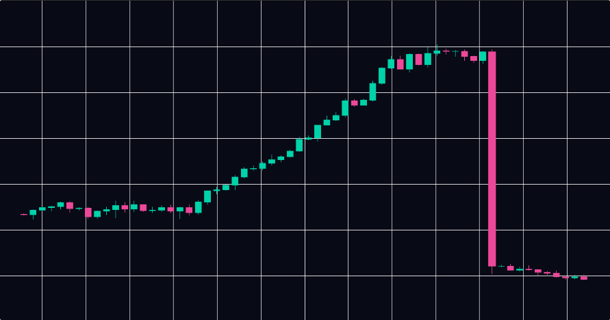
Case Study: $LIBRA Collapse
In February 2025, Argentina’s President Javier Milei endorsed $LIBRA, a political token that quickly reached a $4.5B market cap.
Behind the scenes, wallets connected to strategist Hayden Davis tightly controlled supply.
- Bubblemaps showed that 82% of the supply sat in clustered wallets tied to insiders .
- During the crash, more than $87M was pulled from liquidity pools, while insiders shifted funds across connected wallets .
- Instead of selling openly, developers re-routed liquidity into one-sided pools, leaving retail traders exposed .
For retail investors, this case shows why visualization matters.
Numbers on a dashboard may show high volume and rising TVL, but only Bubblemaps revealed that the project was structurally controlled by a handful of insiders.
That early warning could have saved millions.
Choosing Web3 Analytics Tools
Each tool provides a different lens into the market:
- Glassnode: Deep metrics and historical datasets.
- Dune Analytics: Custom queries and dashboards.
- Nansen: Whale tracking with wallet labels and alerts.
- Arkham: Address identification and entity mapping.
- CoinMetrics: Long-term, institutional-grade datasets.
- IntoTheBlock: Easy-to-read visualizations.
- CryptoQuant: Exchange flows, miner behavior, derivatives positioning.
Why pair them with Bubblemaps?
Numbers tell you what is happening. Bubblemaps shows you who is behind it. Together, they provide the most complete picture of token health and market risk.
Turning Data Into Decisions
On-chain analytics gives every investor a way to look beneath the surface of the market.
By studying wallet activity, supply concentration, exchange flows, and liquidity depth, you can identify where risk is bundled and where networks are truly decentralized.
Dashboards like Glassnode, Nansen, or Dune deliver the raw metrics, while visualization of blockchain data makes those metrics easier to interpret.
When you combine numerical signals with visual maps of token distribution with Bubblemaps, patterns such as insider clusters, coordinated transfers, or healthy decentralization become clear.
For retail users, this means fewer blind spots when deciding whether to buy or hold.
For advanced users, it means stronger conviction backed by both quantitative analysis and direct visualization.
Together, this layered approach turns on-chain data analysis into a practical edge in token distribution crypto markets.